4. Framework
This page contains a detailed overview and usage manuals for the core components of DATAGERRY. The three main main components are Categories, Types and Objects which interact in the following way:
Note
4.1. Managing Categories
Categories are used to organize Types by grouping them. It is possible to structure Categories hierarchically by defining an existing Category as a parent. To manage Categories go to Framework => Categories.
4.1.1. Categories overview
In the overview of Categories is the “Category-Tree” which displays the current structure of the Categories. The “Category-List” displays all exisiting Categories with additional information like the PublicID or the ParentID. At the top right corner two buttons to either create a new Category (“+Add”-Button) or to rearange the exisitng Categories.
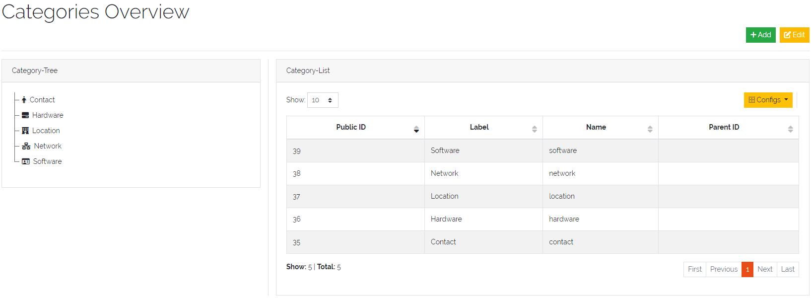
Picture: Overview of Categories
The tree of Categories and the assigned Types are displayed in the sidebar in the “CATEGORIES”-Tab on the left side of DATAGERRY. Each Type which is not assigned to a Category will be displayed below in the UNCATEGORIZED-Section.
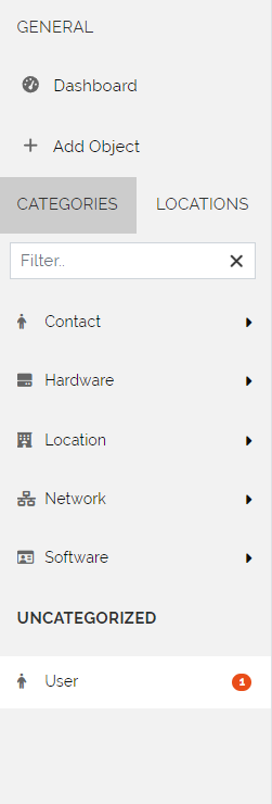
Picture: Displayed Categories in the Sidebar of DATAGERRY
4.1.2. Create a Category
To create a new Category press the “+Add”-Button in the “Categories Overview”. All unassigned Types are displayed in the left overview “Unassigned types” and can be Drag/Dropped in the area “Types” in the “Basic information” section. In the “Basic information”-Section it is poosible to set the following properties:
Field |
Description |
|---|---|
Name |
A unique identifier for the Category |
Label |
The displayed label of the Category |
Icon |
The icon displayed in front of the Category (displayed in the sidebar) |
Parent |
Select the top Category if this one should be a sub Category |
Types |
Drag/Drop all Types in here which should be grouped by this Category |
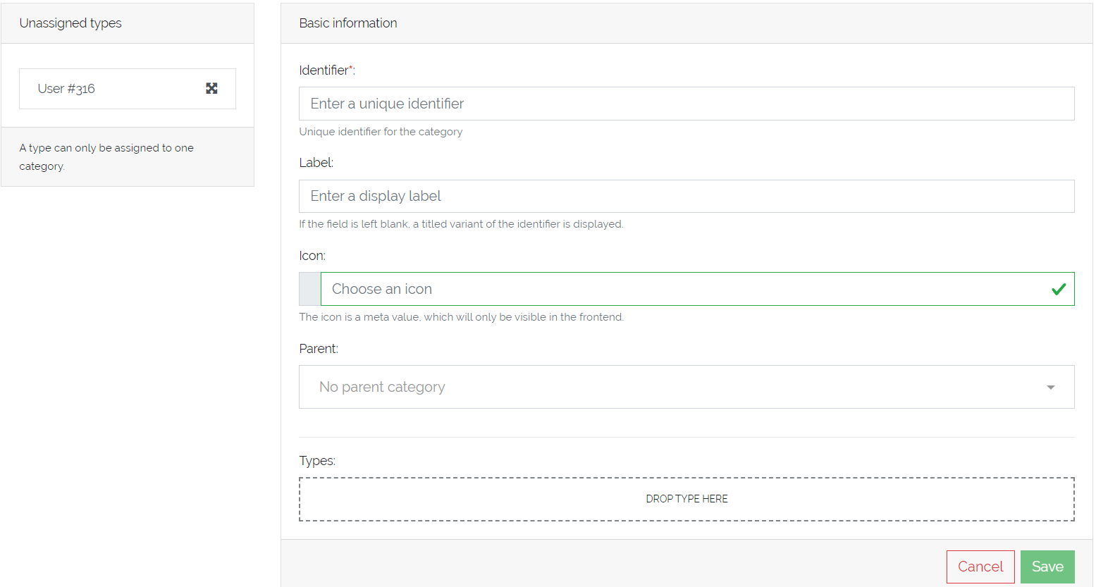
Picture: Adding a Category
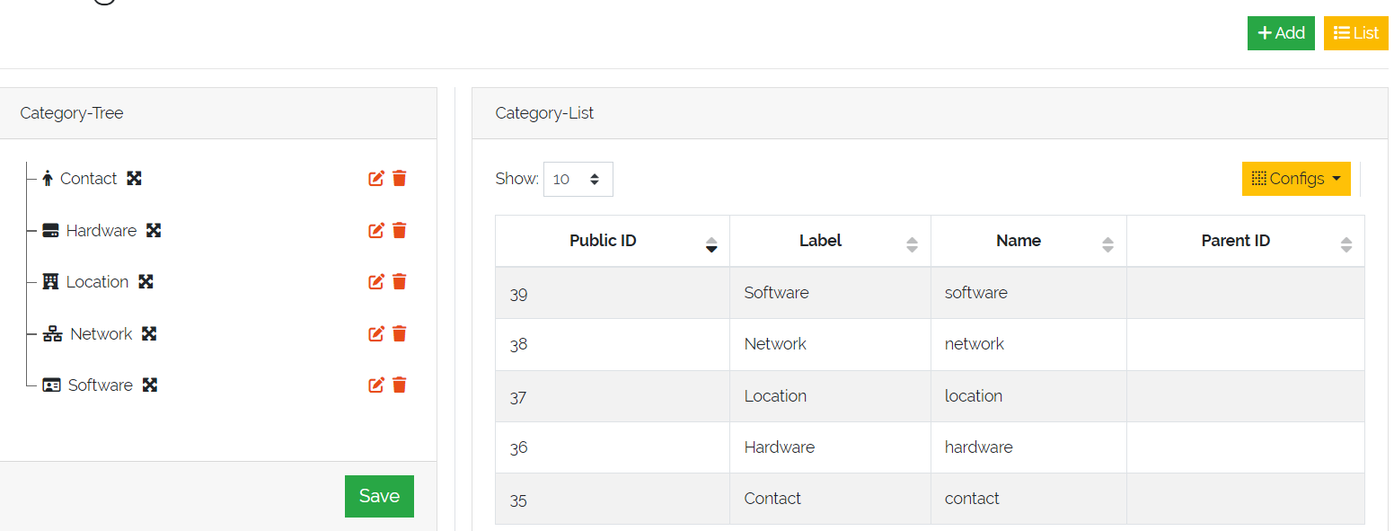
4.1.3. Edit/Delete a Category
To edit a Category press the “Edit”-Button in the top right corner of the “Categories View” which toggles the “Category-Tree”-Section. Here it is possible to rearange the order of the Categories by Drag/Drop the icon right of the Category-Label. The two actions after each Category allows it to either go to the “Edit”-Form of the Category or delete it (by pressing the “Trash Bin”-Icon).
Note
Deleting a Category will not delete the assigned Types.
Picture: Edit a Category in “Category-Tree”
When editing a Category inside the “Edit”-Form it is also possible to rearange the order of the assigned Types as well as modify the assigned Types.
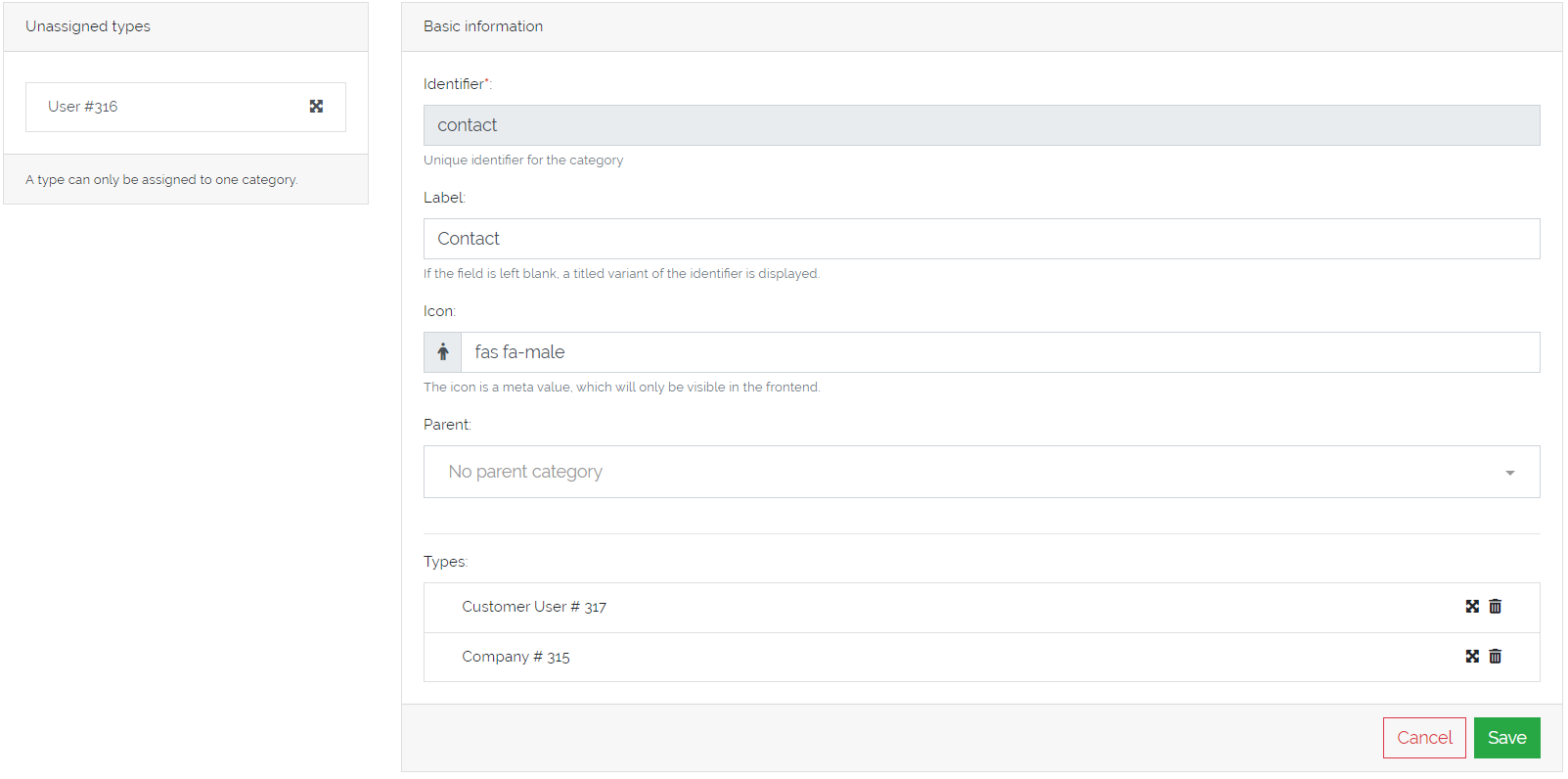
Picture: Edit a Category in “Edit”-Form
4.2. Managing Types
To manage Object Types select Framework -> Types in the menu bar:
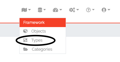
Figure 2: Type list overview
4.2.1. Adding/Editing a Type
In the Object Type list click on “Add” to add a new type, or click on the “Edit” icon to edit an existing type. A wizzard will guide you through the process.
At first, some basic information about the type will be asked:
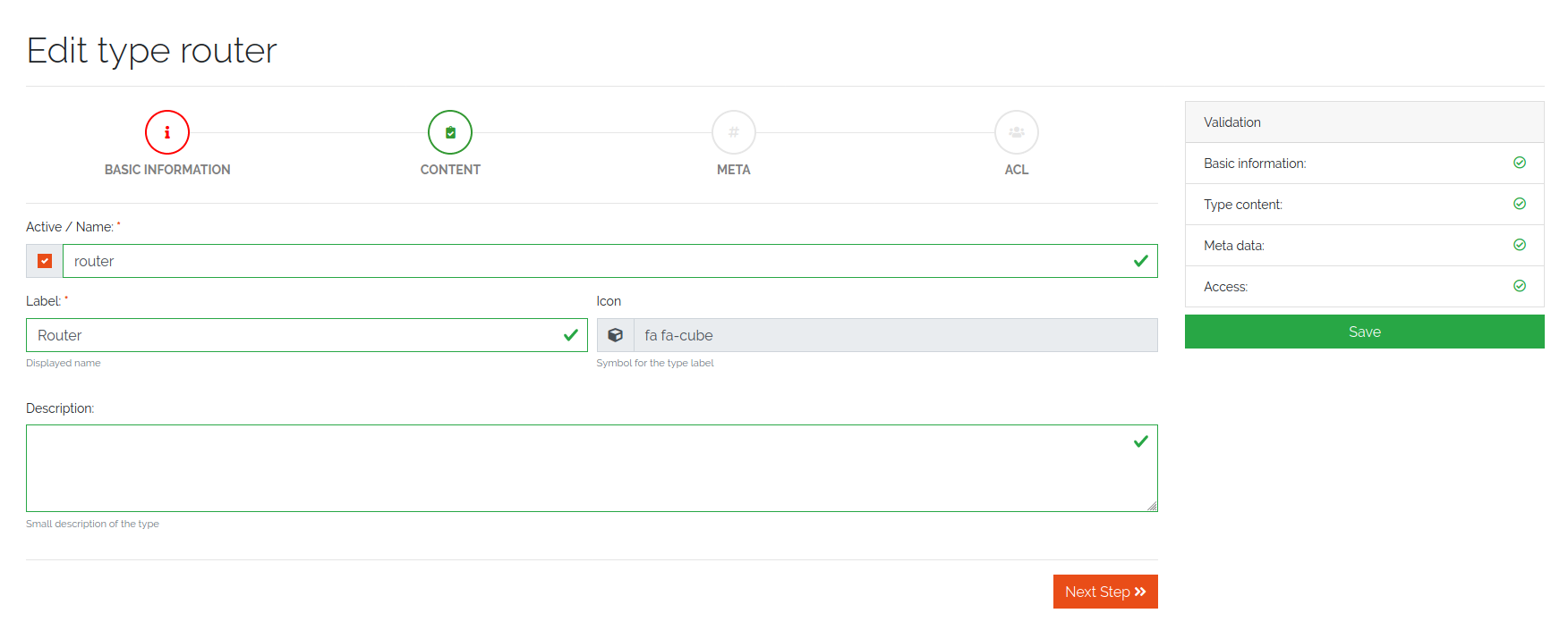
Figure 3: Add a new type
Choose a label and icon for the Object Type, that will be shown in the frontend. The name of the Object Type will be created automatically and cannot be changed and is only for internal use. Each Type is connected with a category. With the exception of name, each setting on this page can be changed at any time.
The next step is the definition of the object fields see the following figure 4:
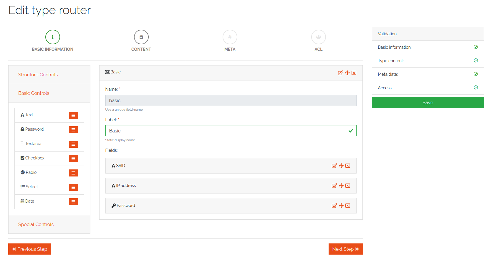
Figure 4: Definition of the object fields
Fields are organized in “Sections” and “Reference Sections”. To add a new section or field, choose an element from the left side box and move it to the center with drag and drop. At first, add a ‘section’ or a ‘reference section’ (you find it under “Structure Controls”), after that, choose one or more fields. Each field or section has a name and label. A name will be created automatically and cannot be changed manually, while a label can be changed at any time. Depending on the field type, several options can be set. Currently we support the following field types:
Type |
Description |
|---|---|
Text |
A text field. Content validation with regular expression is possible |
Password |
password field with integrated password generator and hiding of content |
Textarea |
Textbox with multiple lines |
Checkbox |
A boolean checkbox |
Radio |
Selection between multiple options |
Select |
Selection between multiple options with a dropdown menu |
Date |
A Date string according to the date format (ISO 8601) |
Reference |
Reference to another object of a specific type. E.g. connection between a router and a location object |
Reference Section |
This binds a section with all fields of a referencing object completely as a display. |
4.2.2. Special Controls
A “Reference” field type embeds a summary of a referencing object as a display. The summary for each object definition is predefined in the type generator under the “Meta” tab. See Figure 7. With the field type “Reference” it is possible to override the predefined summaries and make them user specific. See Figure 5.
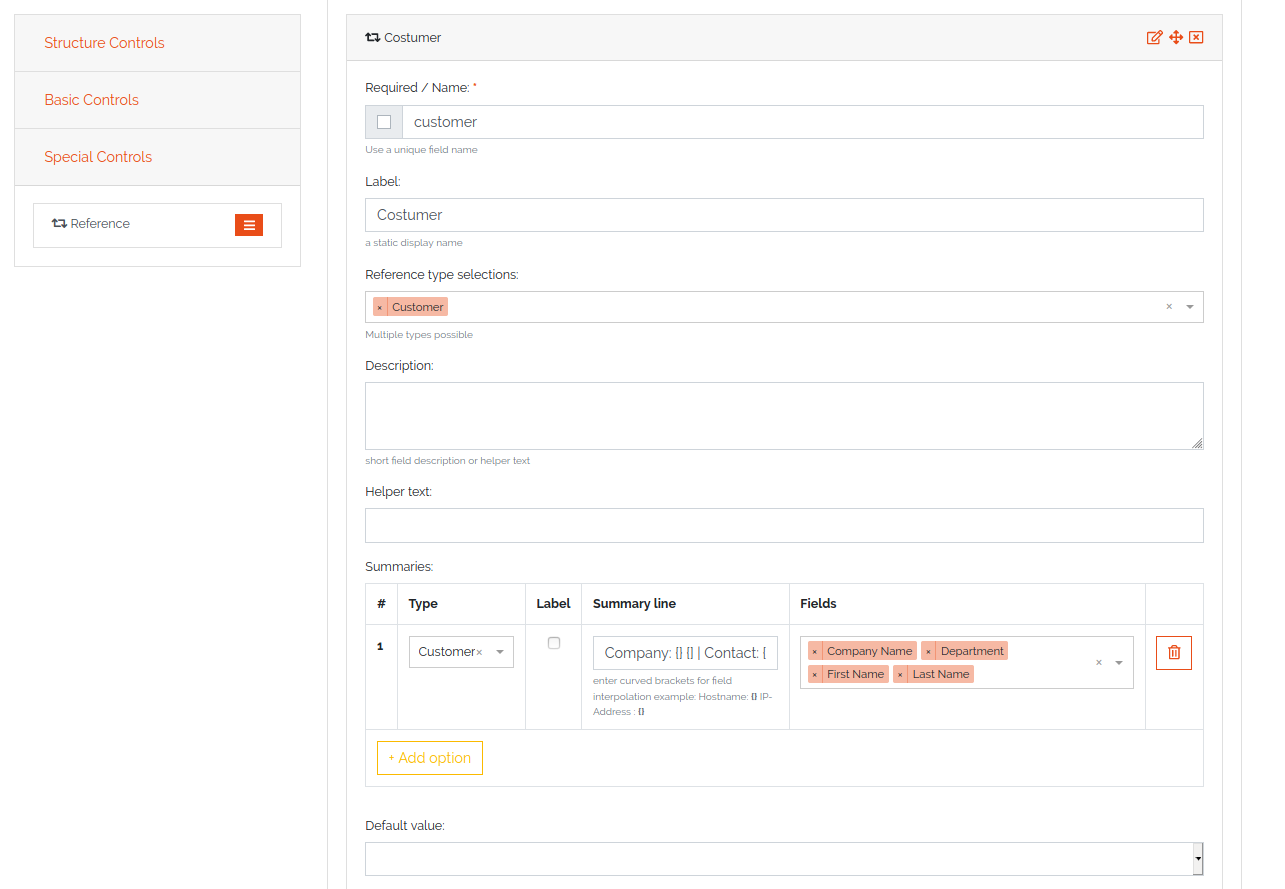
Figure 5: Definition of the special fields
4.2.3. Reference Section
A reference type “Section reference” binds a section with all fields of a referencing object completely as a display. The search for the field values is run through like a normal field. The references are expanded accordingly, so that a distinction is made between field references and section references.
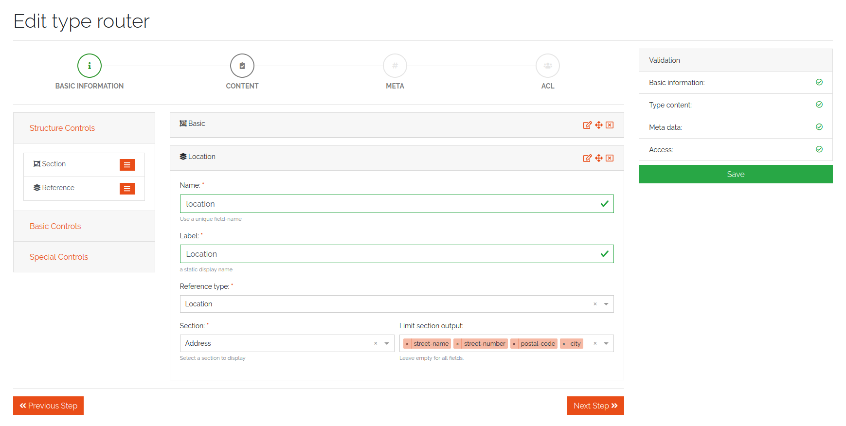
Figure 6: Definition of the object fields via reference section
On the next page on the configuration dialog, meta information can be set:
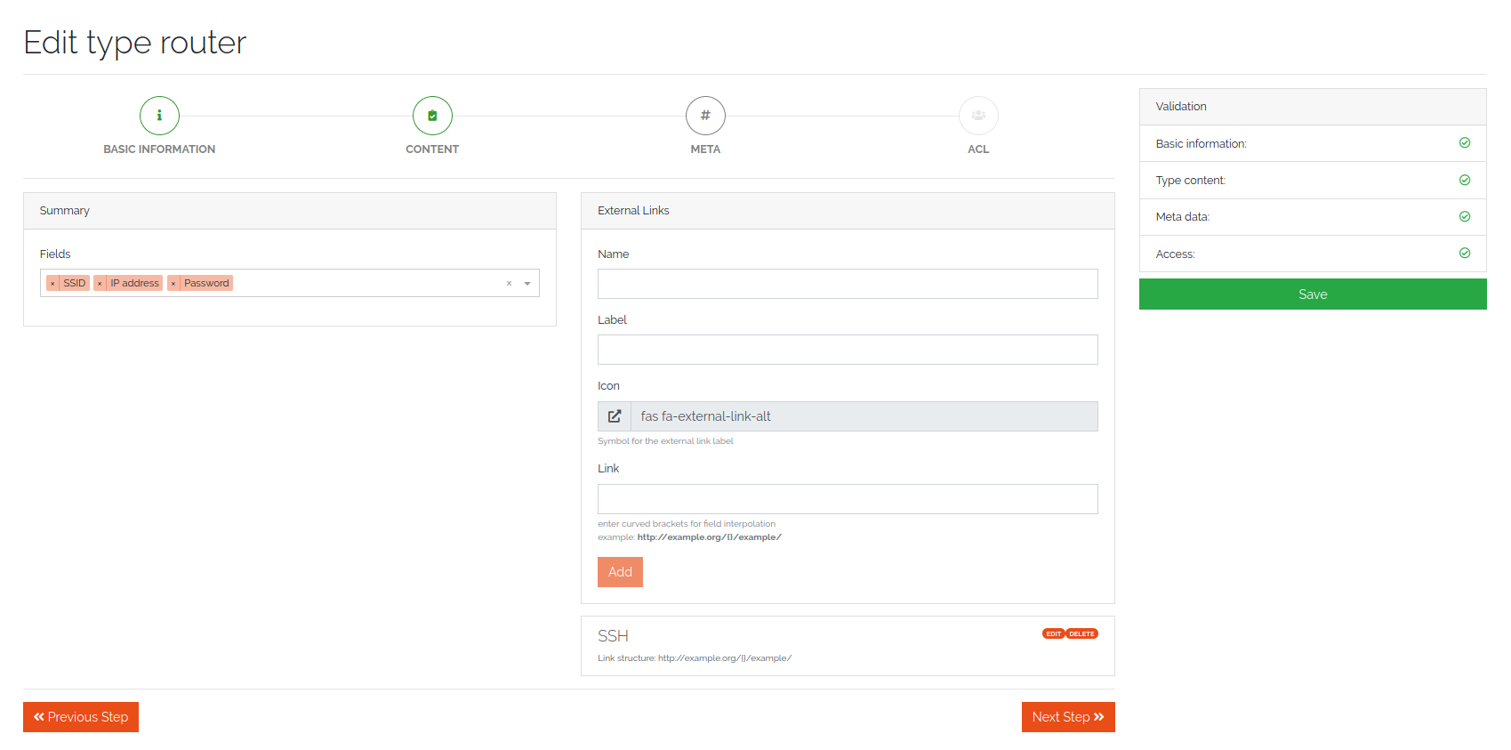
Figure 7: Meta information
Each object has summary fields. These fields summarize the object and are shown by default in object lists. On a router, this could be a management ip and a hostname. The summary fields can be set under “Summary”. Also, external links can be set, which are shown on the object page to add a quick link to the webUI of another system. An External Link has a name, a label, an icon and the link (URL) itself. In the link, use curved brackets to access values of an object field.
4.2.4. Changing an existing Type
Existing Object Types can be changed at any time, just edit the Object Type and add or remove fields or other details. The Object Type definition will be applied to all existing objects, so if you remove a field, it will not be shown in DATAGERRY anymore. The removed field still exists in the database and if you add the field again, you can access the old content. To cleanup the database and sync Object Type definition with the database, click on the “Cleanup” button in the object type list.
4.2.5. Importing/Exporting Types
Object Types can be exported in JSON format. In the Object Types list, click on the yellow “Export” button to get a file in JSON format. By default, all Object Types will be exported. If you only want to export specific types, select items in the list and click on the “Export” button.
Object Types can also be imported from a JSON file. In the menu, choose “Type Import/Export” -> “Import Type” and upload a JSON file with type definitions. During the import, you can choose, which types from the JSON file should be imported.
4.3. Managing Objects
You can access Objects in DATAGERRY in several ways:
using the Category tree on the left side
using the search bar at the top
When using the Category tree, you can choose an Object Type (e.g. router) and get a list with all objects of that type. By default, only summary fields of an object are shown in the table, with the yellow settings button, additional fields can be faded in.
4.3.1. Active und Inactive Objects
Objects in DATAGERRY can be active or inactive. Inactive Objects are hidden in the WebUI and were not exported to external systems with Exportd. By default, all new created Objects in DATAGERRY are active. You can set an Object to inactive by hitting the small switch on the Object view page.
If you want to see inactive Objects in the WebUI, click on the switch under the navigation bar.
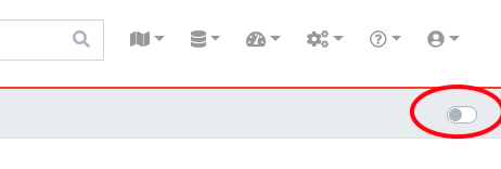
Figure 8: Active / Inactive objects switch
4.3.2. Object tables search / filter
Searching a table is one of the most common user interactions with a DATAGERRY table, and DATAGERRY provides a number of methods for you to control this interaction. There are tools for the table search(search) and for each individual column (filter). Each search (table or column) can be marked as a regular expression (allowing you to create very complex interactions).
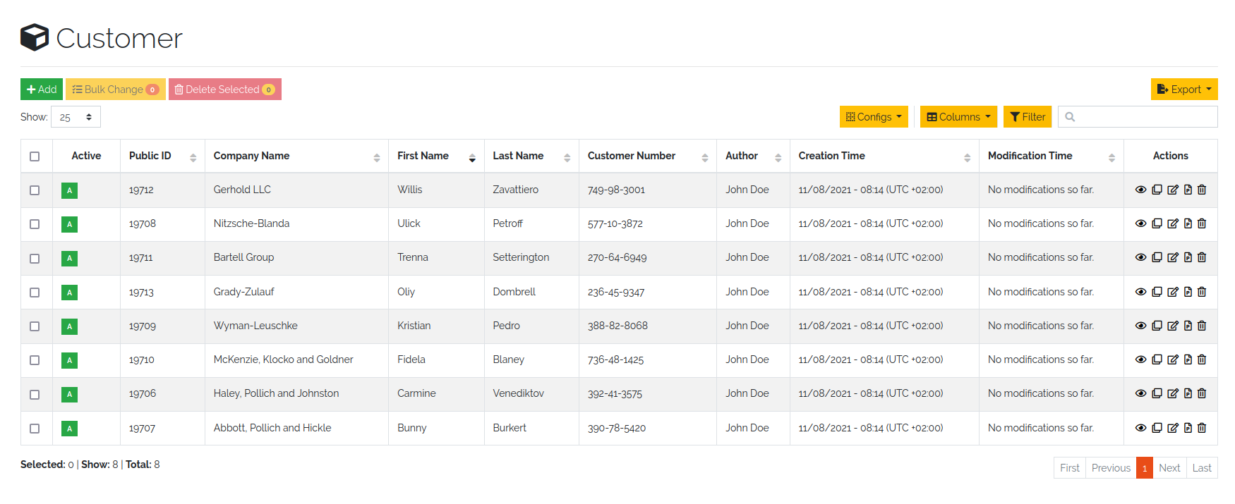
Figure 9: Unfiltered object overview
4.3.2.1. Table search
The search option offers the possibility to check the results in a table. The search is performed across all searchable columns. If matching data is found in a column, the entire row is matched and displayed in the result set. See Figure 10: Search result after searching for “B”
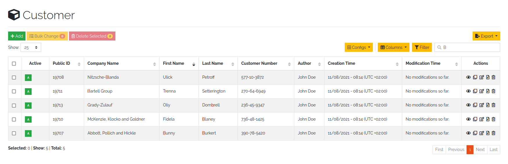
Figure 10: Search result after searching for “B”
4.3.2.2. Table filter
While the search function offers the possibility to search the table, the filter method provides the ability to search for data in a specific column.
The column searches are cumulative, so additional columns can be inserted to apply multiple individual column searches, presenting the user with complex search options.
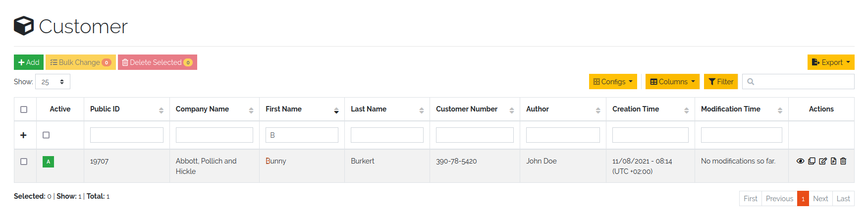
Figure 11: Filter result after filtering for “B”
The search terms within different rows are linked with each other with the condition OR (Figure 12: Filtering by OR-expression). The search terms within a row are all linked with the condition AND (Figure 13: Filter by AND-expression). Only the filtered objects are available for exporting the values from the current table.
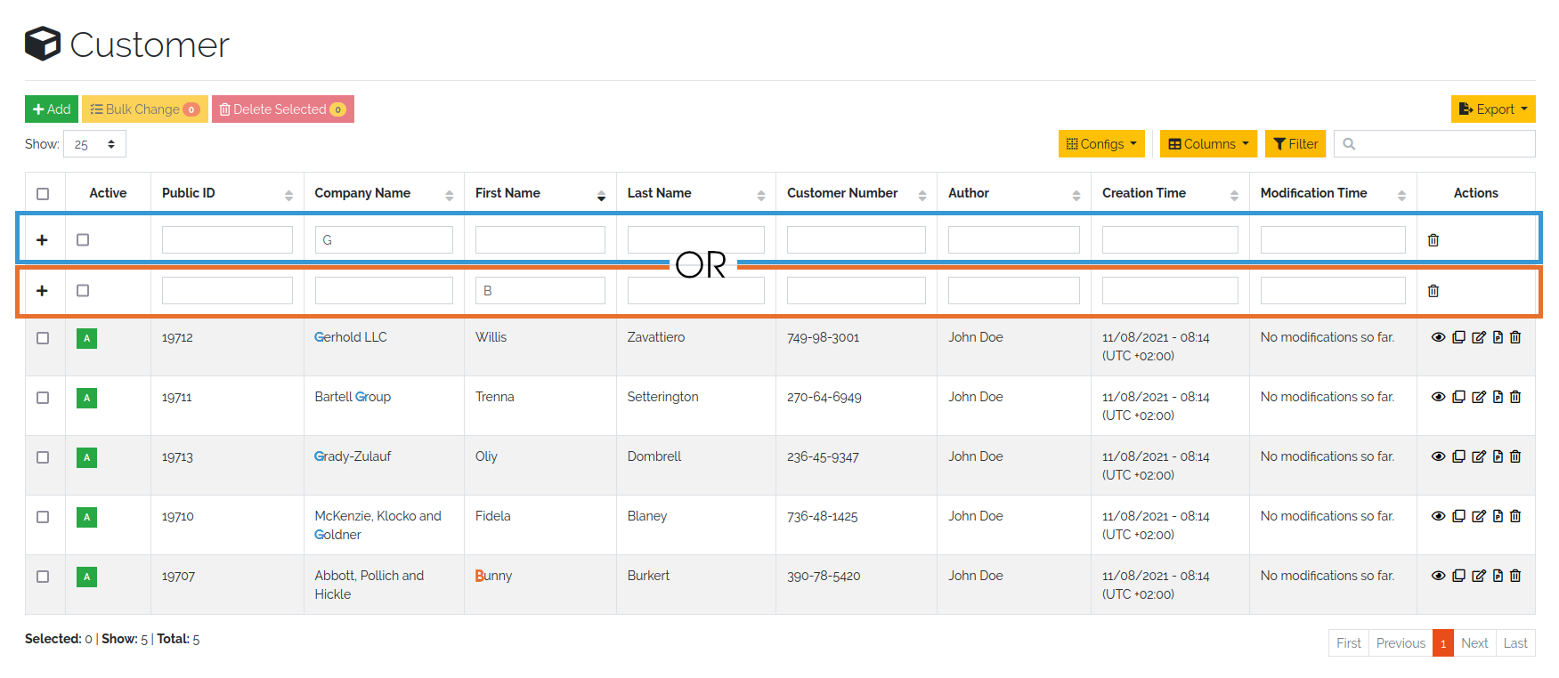
Figure 12: Filtering by OR expression
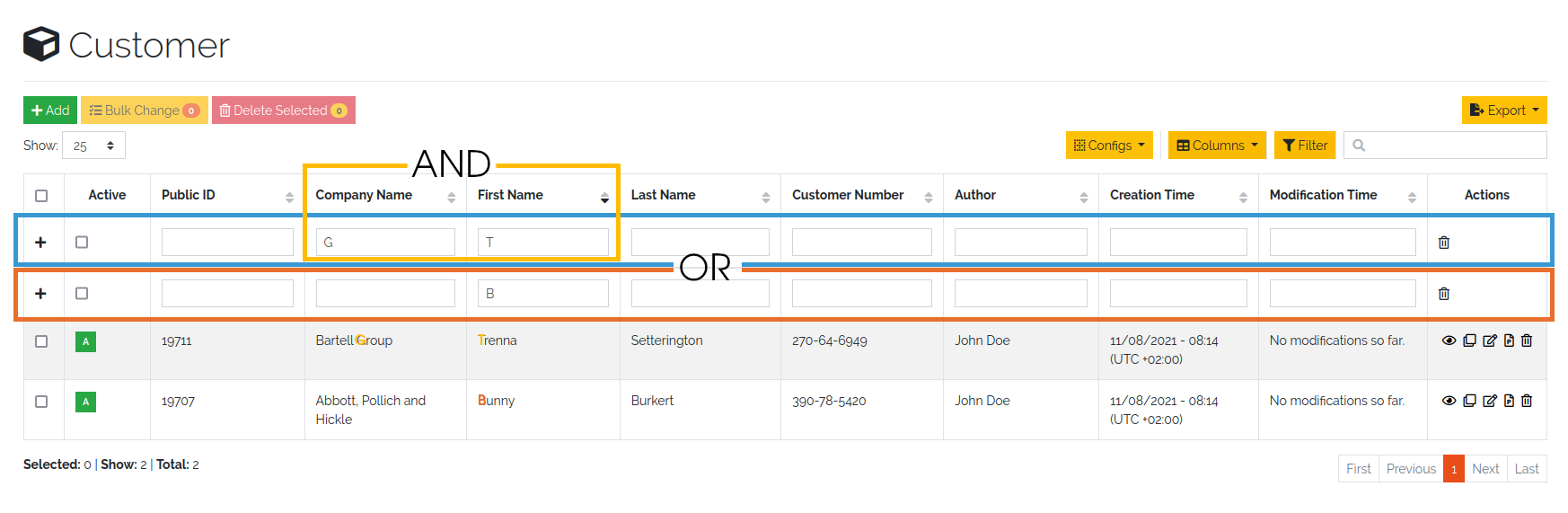
Figure 13: Filtering by AND expression
Note
Date values must be searched according to the following format:
Format: YYYY-MM-DDThh:mmZ
Example: 2019-12-19T11:02
4.3.3. Bulk change of Objects
The bulk change is a function in DATAGERRY with which several objects can be changed in one step on the basis of change templates. With this change, the selected objects adopt the field values of the change template.
Start
Simply select all objects you want to change and click on the yellow button for mass changes above the list.
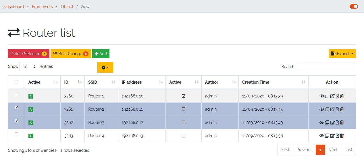
Figure 14: Select objects for bulk change
Template
A change template is generated based on the assigned object type. The following change template is identical to the creation of a regular object. Store all contents that you want to transfer to the objects later and save your entries.
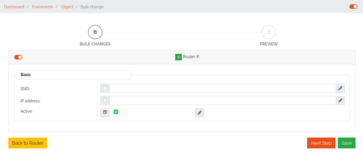
Figure 15: Change template
Preview:
In the preview, all changes made are listed and can be adjusted again if necessary.
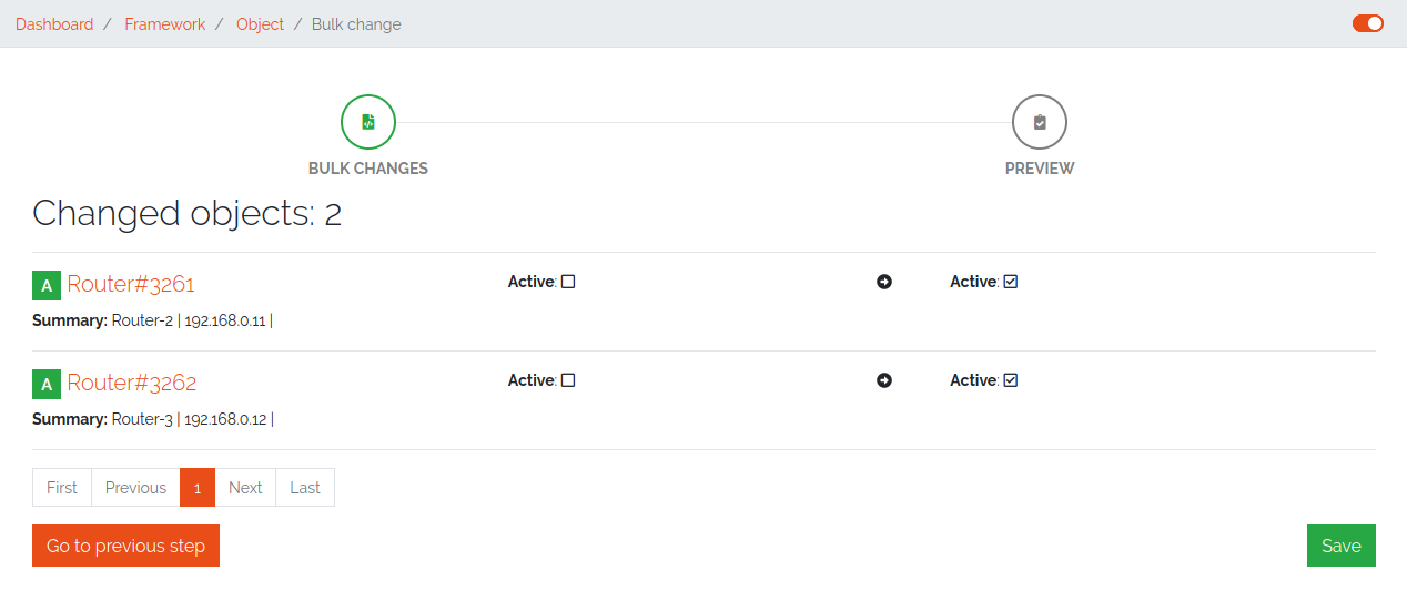
Figure 16: Overview of changes
Result:
After a preview, the selected objects will be changed.
Figure 17: Bulk change result
4.3.4. Exporting Objects
Objects can be exported in several formats. Currently we support:
CSV
Microsoft Excel (xlsx)
JSON
XML
To export objects, click the “Export” button in an object list and select the desired format. Only objects of a single type can be exported (therefore you will not find the “Export” button in a list with objects of multiple types).
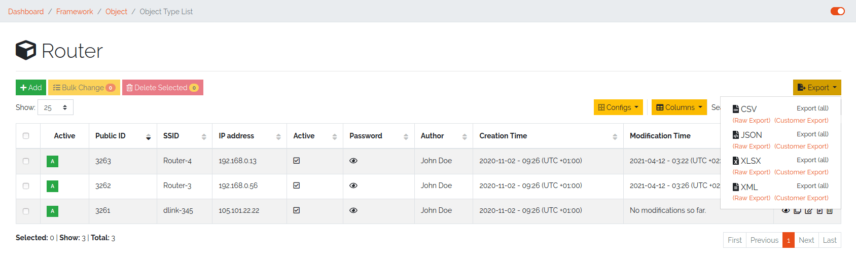
Figure 18: Export from object list overview
Type |
Description |
|---|---|
Raw Export |
All fields of the objects are exported raw. This functionality makes it easier for the user to make some changes and import the changed data back into DATAGERRY. |
Customer Export |
Only the fields selected by the user are exported. When using a quick filter in the table, only iltered objects are exported and only rendered fields are displayed instead of raw data. |
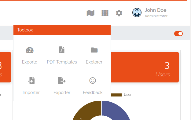
Figure 19: Export / Import via Toolbox
4.3.5. Importing Objects
To import Objects, choose “Objects Import/Export” -> “Import Objects” from the menu. Currently we support the import of the following file formats:
CSV
JSON
To start an import, upload a file and choose the file format. Depending on the format, you have to make some settings before an import can start.
4.3.5.1. CSV Import
During an import from a CSV file, a mapping of rows to object fields must be defined with a drag and drop assistent. If the CSV file contains a header that matches the name of object fields, the mapping will be predefined in the WebUI. Also object references can be resolved with “Foreign Keys”. For example, router objects with a field “location” should be imported. There are Location objects in DATAGERRY with a field “name”, that contains an unique name of a Location (e.g. FRA1). The CSV file with router Objects contains the unique location name. If you choose “foreign key: location:name” in the mapping wizard, a reference to the correct Location object will be set during the import.
4.3.5.2. JSON
DATAGERRY can import Objects from a JSON file. The JSON format correspond to the format that was created when exporting Objects.
4.4. Access Control
Datagerry uses multiple access controls to restrict the access to data and functions. In addition to the Access Rights. implemented by default at the user management level, there is also the concept of the access control list. These are currently only implemented for the object level, but will be extended to various sections of the core framework. They should provide more precise setting options for accesses within already authorized levels/functions.
4.4.1. Access Control List
The concept of ACL is basically very simple. They are, as the name suggests, lists that have group references with certain permissions. In our case, the user group is stored there. So if a user wants to get access via an ACL, this is only possible if the complete user group is listed in the ACL. The permissions define which actions are granted to a group within an ACL. This allows different operations to be defined even more precisely.
4.4.1.1. Permissions
By default, four permissions are possible:
Create a resource
Read a resource
Update a resource
Delete a resource
based on the four basic functions of persistent storage. Further permissions can theoretically be added, but these are not planned at the moment.
4.4.1.2. ACL vs. System-Rights
The difference between the system rights and the ACL is that the ACL only improves the system rights and makes the accesses more detailed. They are not a replacement for the rights, they only extend the restrictions. Groups that do not have rights for certain actions (for example: viewing an object) cannot do this, even if their group is explicitly listed in the respective ACL.
4.4.2. Object ACL
The ACLs of the objects protect them from unauthorized access. They are used to make objects accessible to certain user groups or to hide them. This affects not only the view of the objects themselves, but any aspect of CRUD access to objects, up to and including search, export, etc.
In principle, there are five different access situations to objects.
Configuration |
Access |
|---|---|
No ACL defined |
Everyone has access to objects of this type |
ACL deactivated |
Everyone has access to objects of this type |
ACL enabled, but group not included |
No access to objects of this type |
ACL enabled and group included, but not the grant permission of the operation |
No access to objects of this type |
ACL enabled and group included and grant permission of the operation |
User group has access to objects of this type |
Why additional protection of objects?
Datagerry instances can be defined large and complex. In many companies there are different hierarchies and access restrictions to different information areas. Until now, DATAGERRY only offered the possibility to give groups general read/view rights to objects, but not to make individual groups of objects visible only to certain user groups. Here the ACL help to restrict or allow the visibility of object information for certain user groups depending on the configuration.
4.4.2.1. Configure Object ACL
Object ACL are defined in the respective type definitions via the type builder. These can be defined under the ACL step based on the type. By default, they are disabled and the menu is excluded.
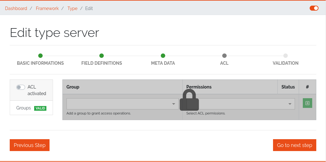
Figure 20: Deactivated object acl
When activated, the menu is enabled and groups can be added to an ACL with the respective permissions.
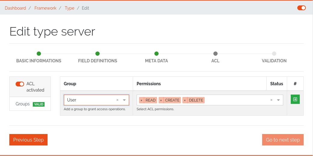
Figure 21: While object acl configure
After adding the groups, they are displayed in the list below and their permissions can be edited further. But a group can only appear once in an ACL. Listing the same group with different permissions in the same list is not possible.
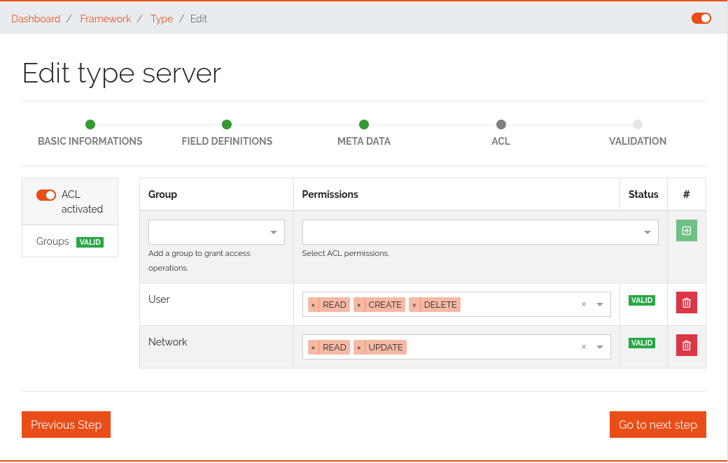
Figure 22: Inserted object acl
The ACL settings are retained at the object level even after the ACL is disabled, but then they are no longer applied.
4.5. Locations
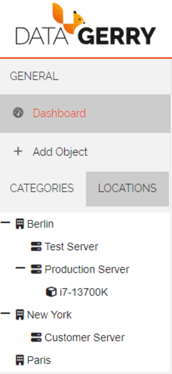
Locations give users the possibility to structure their objects in a tree like shape where the top elements are for example a country or a city and the sub elements are something like offices, rooms, servers etc. This will enhance the overview as well as give the possibility to quickly find an object. The location tree can be found in the sidebar inside the “LOCATIONS”-Tab.
Picture: Locations tab in sidebar
4.5.1. Initialise Location-Functionality for a Type
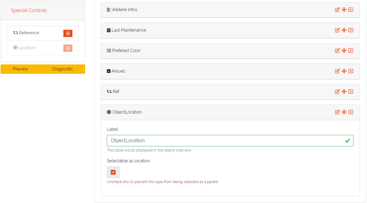
In order to display Objects in the Locations-Tab the corresponding Type needs to have assigned the Special Control Location in it’s type configuration. To do this open the type overview via Framework => Types in the top right corner and press the Edit-Icon from the Actions-column for the Type which should get the Locations functionality.
In the type configuration switch to the Content-Tab and on the left side in Special Controls drag the Location-Control inside the fields-area of a section.
Note
A Location-Control can only be assigned once to a Type.
Picture: Location control in type configuration
The Location-Control contains two fields, “Label” and “Selectable as Location”. The “Label” is used in the object overview to identify the location field and the “Selectable as Location” defines if this type can be used as a top location for other objects .This is useful if you have a type where you don’t want the have any objects below it, for example you have a Type Server and a Type Processor. The server is the top location for the processor but the processor can not be the top location for any other Types.
4.5.2. Configure a Location for an Object
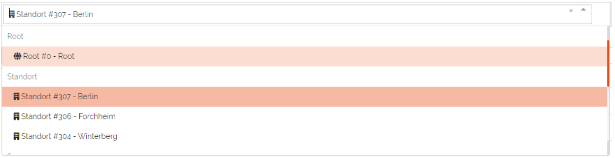
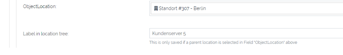
After the Location-Special Control has been added to the Type**(see previous step) switch to the object overview of an **Object of this Type. The Location-Special Control added two fields to the Object. The first is the location selection named after the “Label” which was set in the type configuration. In this field the top location for this Object can be selected.The drop down list contains always the Root-Location which is the top most Location possible. Furthermore the drop down will also contain all Objects which have a Location selected (but not Objects which are directly below the current object in the Location Tree).
Picture: Selection of top location for current location
The second added field “Label in location tree” is used to set the name of this Object when displayed in the Location tree.
Picture: Added fields to Object from Location-Special Control
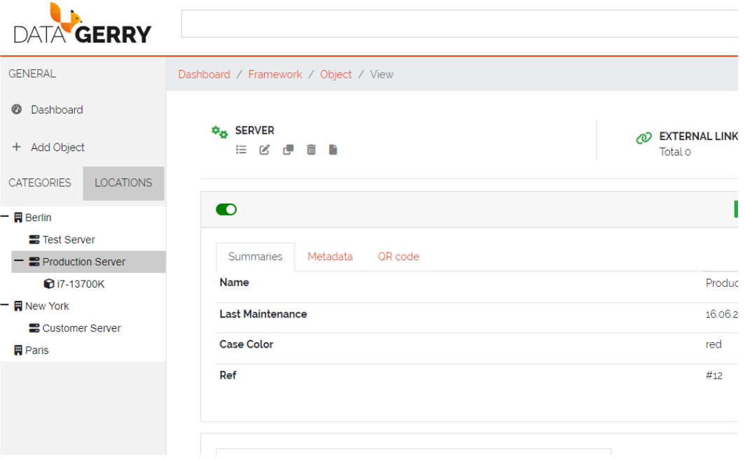
When the top location is selected and the Object is saved it will appear in the Locations-Tab in the sidebar. Each Object in the Locations-Tab can be clicked and will open the object overview of the selected Object.
Picture: Locations in the Locations-Tab
4.6. Section templates
Section templates give users the ability to build custom sections and insert them via drag and drop in type configurations. This is useful when the same group of fields(a section) is used for diffent types. Section templates speed up the creation and modification of types as well as remove the need to create recurring sections for types over and over again.
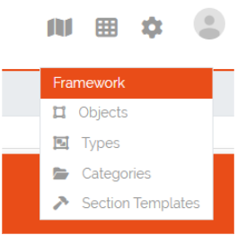
Section templates can be accessed at the top right corner at Framework => Section Templates.
Picture: Accessing Section Templates
4.6.1. Section Templates Overview
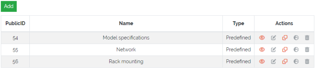
In the Section Templates overview all created templates are displayed with their PublicID, Name, Type and the corresponding actions. At the top left corner of the table is the “Add”-Button with which new section templates can be created.
Picture: Section Templates overview
4.6.2. Creating Section Templates
In this form a section template can be built the same way as in type configurations by drag and drop of elements from the “Controls”-Sidebar into the “Fields”-area of the section. The only control that is not available to section templates is the special control Location since a type can only have one of these controls and is therefore only setable directly in the type configuration. Additionally there is a checkbox in the section header where the template can be defined as a Global section template, this can not be changed when editing a section template. If the checkbox remains unchecked the created section template will be of type Standard.
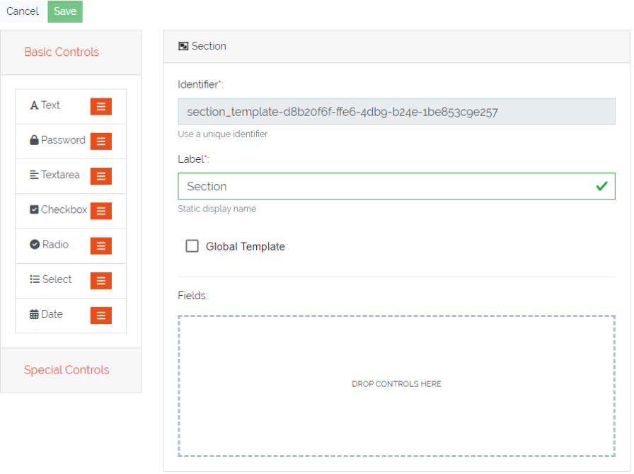
Picture: Creation of Section Templates
4.6.3. Using Section Templates
After a section template has been created it can be used in type configurations. In the sidebar of the type configuration are two areas, the Global Section Templates area which contain all global and predefined section templates and the Section Templates area which contains all Standard section templates. They can be added to the type configuration via drag and drop the same way a new section would be added. Global Section Templates are not editable inside the type configuration.
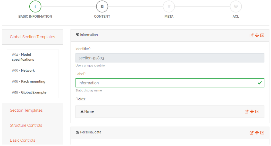
Picture: Using section templates in type configuration
4.6.4. Section Template Types
There are three different types of templates each with a specific purpose. Below is an overview of the characteristics of each section template type.
4.6.4.1. Standard Section Templates
It can be dropped multiple times inside the same type configuration
After it is dragged inside the type configuration it can be further modified and additional fields can be added or existing ones can be deleted
It can be converted into a Global Section Template
Changing a standard section template in the template configuration won’t affect already used instances of it
There is no programatical connection between the Standard Section Template and the type
4.6.4.2. Global Section Templates
It can be dropped only once inside the same type configuration
It can not be further modified after it was added to a type configuration
Changes to the global section template in the template configuration will affect all existing instances of the template
Example 1: Adding a field will add the new field to all existing instances of this template
Example 2: Removing a field will also remove this field from all existing instances of this template (the stored value is lost)
Example 3: Deleting a global section template will also delete the section and its data from all types and objects which are using it
Types are tracking all of their used Global Section Templates
4.6.4.3. Predefined Section Templates
They have the same characteristics as Global Section Templates but are delivered by DATAGERRY
They are not editable or deletable by the user
Users can create a clone of Predefined Section Templates but the clone will no longer be considered as a predefined section template
4.6.5. Section Templates - Table Actions
There are different actions for created section templates depending on the template type. Below is an overview and explanation of each.
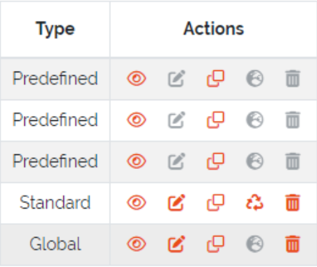
Picture: Actions for created section templates
Open Preview 
Opens a preview of the section template which will display how the created section and its fields will look like.
Edit Section Template 
Redirects the user to the edit form for the section template. This action is not available for predefined templates. Editing a global section template in this form will affect all types and objects using this template.
Clone Section Template 
With this action users can create a clone of an existing template(even a predefined template). A popup will open where the name and the type of the template can be set. After confirmation the clone will be created. A cloned predefined template is either of type standard or global.
Transform Standard Template 
A standard template can be transformed into a global section template by pressing this action. When the template is transformed it is seen as a new global section template which means that the previous uses of this standard template on types are not tracked. Users should consider that this action can not be undone. This action is only available to standard templates.
Global Template Indicator 
This is just an indicator that this template type is Global and should represent that this type can not be transformed. All predefined templates are also global templates.
Delete Template 
With this action section templates can be deleted. Consider that deleting a global section template will also remove it and all set values from types and objects. The amount of affected types and objects will be displayed in the confirmation popup. Predefined templates are not deletable.
4.6.6. Section Templates - Rights
The section for managing Section Templates has its own set of rights.
base.framework.sectionTemplates.*
This right grants all the rights mentioned below and allows the user to do everything with section templates.
base.framework.sectionTemplates.view
This right is required to access the section templates via Framework => Section Templates. Furthermore it is required for the Open Preview action.
base.framework.sectionTemplates.create
This right is required to create new section templates. Together with base.framework.sectionTemplates.edit it is required to clone templates.
base.framework.sectionTemplates.edit
This right is required to edit existing section templates. Together with base.framework.sectionTemplates.create it is required to clone templates.
base.framework.sectionTemplates.delete
This right is required to delete existing section templates. Predefined section templates are not deleteable.